
Every e-commerce brand reaches a tipping point — the moment when product image quality either builds trust or destroys it. We have seen brands lose 30% of their conversion rate simply because their product images looked inconsistent across a catalog of 5,000 SKUs.
Why Image Consistency Matters More Than You Think
When a shopper lands on your product page, they make a decision in under 3 seconds. That decision is almost entirely visual. A dark, inconsistently cropped image next to a bright, perfectly white-background image on the same page sends one message: this brand doesn't care about the details.
Consistency is not about making every image look identical. It is about making every image feel like it belongs to the same world — the same light, the same margin, the same color temperature.
"Catalog consistency is the silent salesman. You never hear it working, but you feel it when it's missing."
The 5 Most Common Catalog Consistency Mistakes
1. Mixed Background Tones
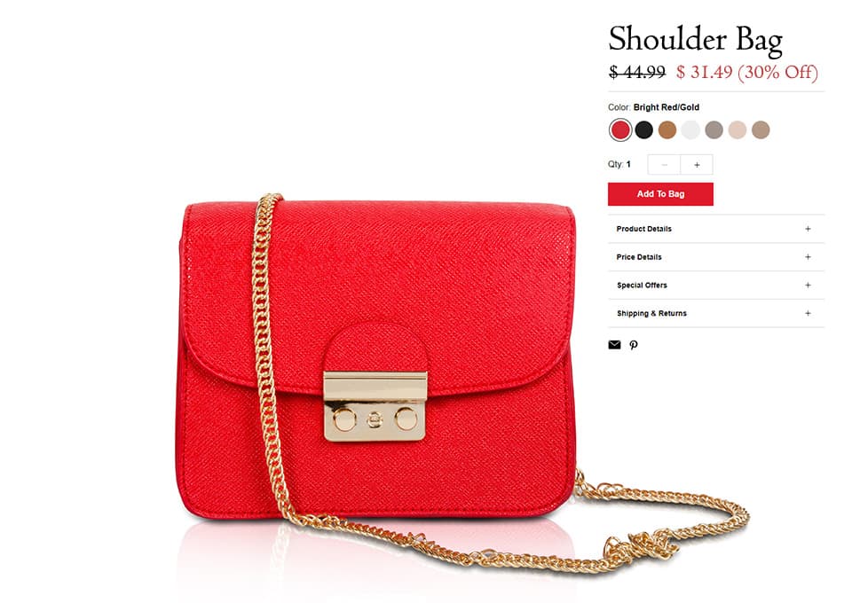
Pure white (RGB 255/255/255) is the Amazon and Shopify standard. But many studios deliver images ranging from 240 to 255 — and when those sit side by side in a product grid, the difference is immediately visible to the human eye. Every background needs to be clipped to a precise value, not just "close to white."
2. Inconsistent Margins and Crop Ratios
If your product fills 85% of the frame on one image and 60% on the next, your grid looks chaotic. Establishing a fixed margin guide — for example, 5% padding on all sides within a 1:1 square — and applying it religiously across every SKU is the foundation of a professional catalog.
3. Shadow Style Changes
Natural shadows, drop shadows, and reflection shadows each create a completely different mood. Mixing them across the same product category is one of the fastest ways to make a premium product look cheap. Pick one shadow style per category and never deviate.
4. Color Grading Drift
When images are edited in batches by different editors without a locked color profile, the white balance drifts. A leather bag that looks warm and brown in one batch looks cool and grey in the next. A calibrated editing pipeline with locked ICC profiles eliminates this entirely.
5. Missing or Inconsistent Retouching
Dust spots on a lens, a crease on a garment, a stray thread on a shoe — these micro-imperfections are invisible in a physical store. On a 4K screen, zoomed to 200%, they are all the customer sees. A proper QC layer catches these before delivery, not after a client complaint.
How to Fix It: The BLACKFOX Consistency Framework
When we onboard a new brand, the first thing we build is a Style Guide Document. This is not a mood board. It is a technical specification — exact RGB values for backgrounds, pixel margin guides for each image ratio, shadow style and angle, skin tone targets for beauty retouching, and output format requirements per platform.
Every editor working on that brand's catalog works from that document. Every QC reviewer checks against it. The result is that image 1 and image 5,000 are indistinguishable in quality — even if they were edited six months apart by different team members.
The Business Case for Getting This Right
The data is consistent across our client base: brands that invest in catalog consistency see measurable improvements in add-to-cart rates, lower return rates (because customers get what they expected), and significantly stronger performance in paid social — because consistent, high-quality imagery performs better in Meta and Google Shopping auctions.
This is not a creative luxury. It is a commercial necessity for any brand serious about scaling online revenue.