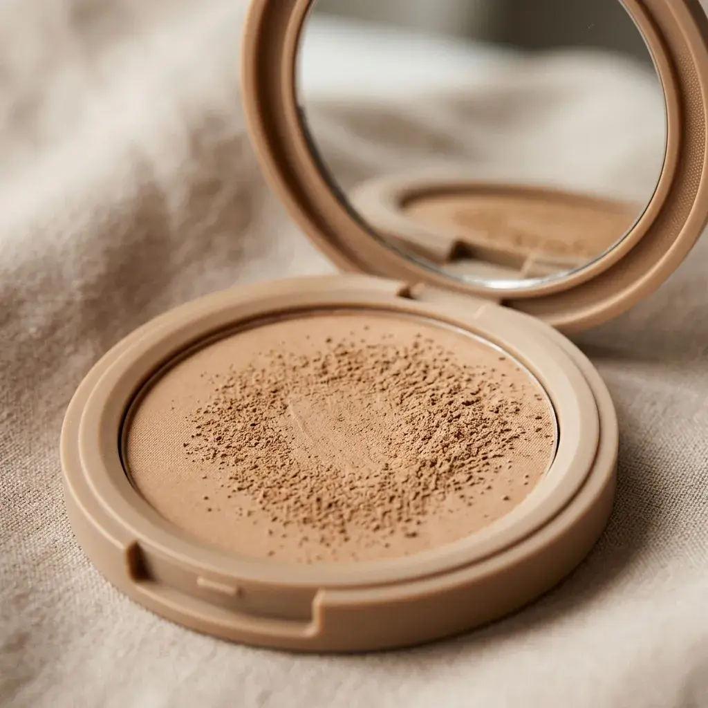
Cosmetics and beauty photography carries a technical burden most other product categories don't: the image isn't just showing what the product looks like, it's implicitly promising what the product will look like on skin. A shade that photographs warmer or cooler than its true tone, a texture that reads glossier or matte than reality, a packaging reflection that obscures the actual color inside the container — each of these creates a gap between expectation and experience that shows up as a return or a one-star review citing "not as pictured." This guide covers what makes beauty and cosmetics editing different from general product retouching, and where the common failure points are.
Packaging: Reflections and Glass/Plastic Surfaces
Beauty packaging is disproportionately glossy, reflective, or transparent compared to other product categories — glass bottles, glossy compact cases, clear plastic tubes showing product color through the container. Reflections from studio lighting, the camera, or the surrounding environment show up more readily on these surfaces than on matte packaging, and cleaning these up without flattening the material's actual shine into something that looks fake is a genuine skill distinct from general clipping-path work. The goal is controlled, intentional reflection that reads as premium rather than either a distracting studio reflection or an unnaturally flat, reflection-free surface that looks retouched to the point of being untrustworthy.
Color Accuracy for Shade-Matching
This is the single highest-stakes area of beauty photo editing. Foundation, lipstick, eyeshadow, and any shade-based product category lives or dies on whether the photographed color matches the physical product closely enough that a customer's expectation holds up when the product arrives. Calibrate against a physical color reference under controlled, consistent lighting for every shade in a line — not just the hero shades — since shade-range consistency matters as much as any single shade's individual accuracy. A brand with 40 foundation shades needs all 40 photographed and color-corrected under identical conditions; inconsistent lighting or white balance across a shooting session that spans multiple days is one of the most common sources of shade-matching complaints, and it's invisible until the images are compared side by side.
Texture and Finish Representation
- Matte vs. dewy vs. glossy finishes need to read accurately in the image — over-retouching a dewy foundation swatch to remove all shine makes it look matte, misleading customers who specifically chose that product for its finish.
- Product texture on application (cream consistency, powder fineness, gel translucency) should remain visible rather than smoothed away, since texture is often a primary reason customers choose one formula over another.
- Swatch shots need consistent application pressure and technique across a full shade range — a swatch applied more heavily than others in the same set will read as a different opacity or finish, creating a false comparison within the product line itself.
Retouching Restraint on Skin in Application Shots
When beauty products are shown applied to skin — on a model's face, a hand swatch, a texture close-up — the temptation to retouch the skin itself the way a fashion or portrait photo would be retouched works against the product's credibility. Heavily smoothed, pore-free skin in a product application shot obscures how the product actually performs on real skin texture, which is precisely the information a shopper is trying to extract from the image. The retouching standard for beauty application shots should preserve visible skin texture and pores while removing genuine technical flaws (dust, sensor spots, stray hairs) — a different and more restrained standard than general beauty photography retouching for editorial or advertising use.
Background and Studio Consistency Across a Shade Range
Beauty brands frequently need to photograph the same product across many shade variants, and background/lighting consistency across that full range is a bigger technical challenge than most other categories face, simply due to volume — a 40-shade foundation line means 40 separate photography and editing passes that all need to look like they belong to the same consistent visual system. Lock exposure, white balance, and background settings across the entire shooting session for a shade range rather than adjusting per-shade, and flag any shade that required different settings for a manual color-accuracy double-check, since deviation from the standard setup is often where shade-matching errors originate.
Ingredient and Claim-Adjacent Imagery
Many beauty products photograph supporting elements alongside the product itself — raw ingredients (botanicals, oils, minerals), texture close-ups meant to imply a specific sensory quality, or "before/after" style comparison shots. These carry more regulatory sensitivity than standard product photography in most markets, since claims implied visually (not just in text) can trigger the same advertising-standards scrutiny as written claims. Retouching that exaggerates an ingredient's visual appeal or implies a result the product doesn't actually deliver is a compliance risk as well as a returns risk, and this is worth flagging explicitly in any brief given to an editing vendor.
Editing for Multiple Contexts: Hero, Zoom, and Marketplace Thumbnail
A single edited image often needs to hold up in several very different display contexts — a large hero image on a brand's own product page, a marketplace's zoom function that magnifies fine texture detail, and a small thumbnail in a search results grid. Beauty images are more sensitive to this than most categories because color and texture accuracy, the two things that matter most, are exactly what degrade first at small sizes or heavy compression. Review edited images at the actual thumbnail size they'll display at on your primary sales channels, not just at full resolution, since a shade difference invisible at full size can become the deciding factor in a small search-result thumbnail where it's the only visual information a shopper has to compare options.
Common Beauty Photo Editing Mistakes
- Over-brightening or over-saturating shade swatches to make colors "pop," which creates a mismatch with the true product color that shows up as a return reason.
- Removing shine or texture inconsistently across a set, making some images look matte and others glossy for products that should read identically.
- Retouching model skin to a degree that obscures how the product actually performs on visible pores and texture.
- Inconsistent white balance across a shade range shot over multiple sessions, creating shade-matching complaints that only become visible once the full range is compared.
- Over-polishing packaging reflections into an unnaturally flat surface that reads as artificial rather than premium.
Secondary Packaging and Box Photography
Beyond the product itself, many beauty listings need clean images of the outer box or secondary packaging — particularly for gift sets, limited editions, or products where regulatory ingredient listings on the box are relevant to the purchase decision. Box photography carries its own edge cases: flat printed cardboard reflects light differently than a glossy bottle, embossed or foil-stamped branding elements can either read as premium detail or wash out into a flat glare depending on lighting angle, and small printed text (ingredient lists, certifications, batch codes) needs to stay legible through the editing process rather than getting softened by noise reduction or sharpening applied uniformly across the whole image. Treat box shots as their own editing pass rather than an afterthought tacked onto the main product photography workflow.
Showing Shades on a Range of Skin Tones
A shade swatched on one model only helps the shoppers whose skin looks like that model's. For foundation, concealer, lipstick and blush, swatch every shade on at least three skin tones, light, medium and deep, and label each image clearly with the shade name and the skin tone. Arm or hand swatches are fine, and they are much easier to keep consistent than full-face shots.
Photograph all the swatches in one session under the same light, and correct them as one batch. If two skin tones were shot on different days, check them side by side before publishing, because a small white-balance difference between sessions can make a shade look like it changes colour from one skin tone to the next.
Showing What Is Inside the Packaging
Customers buy the formula, not the bottle, so at least one image should show the product itself:
- Open jars and compacts with the lid off, so the true colour and surface of the cream, powder or balm are visible.
- Lipsticks with the bullet fully twisted up, shot from the side so the shape and finish are clear.
- Eyeshadow palettes photographed straight on, with every pan in focus and evenly lit.
Use fresh, untouched products: fingerprints in a pressed powder or a dented bullet are hard to retouch convincingly. If a retoucher does clean up crumbs or dust around the product, the formula's own colour and texture should stay exactly as they are.
A Practical Checklist for Beauty Product Photo Editing
- Verify shade color against a physical reference sample for every SKU in a range, not just hero shades.
- Confirm consistent lighting and white balance across a full shade range, especially when shot across multiple sessions.
- Preserve visible texture and finish rather than smoothing swatches into a uniform, generic look.
- Keep skin texture visible in application shots rather than applying editorial-level skin retouching.
- Check packaging reflections read as controlled and premium, not distracting or unnaturally flat.
- Flag any ingredient or claim-adjacent imagery for a compliance review before publishing.
Our beauty and cosmetics photo editing service is built around the color-accuracy and texture-preservation standards this category demands. Submit a free sample batch across your shade range to see how we handle consistency at scale.