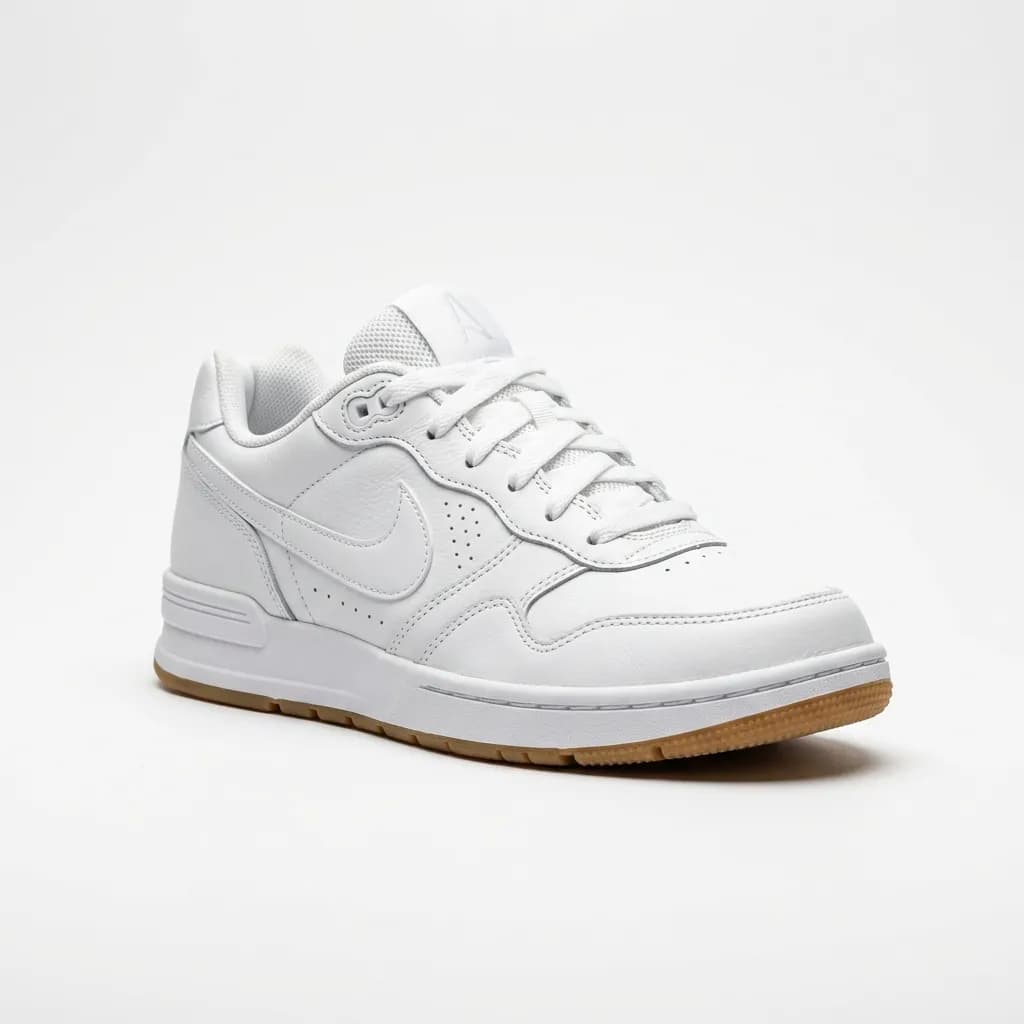
A crooked label or a dented carton corner is a small detail — until your product sits next to a competitor's on the digital shelf. Here's exactly what packshot retouching fixes, how it's done, and how to brief it correctly.
A packshot is the product exactly as it ships — the bottle, the carton, the jar, the can — photographed against a clean background for a retail listing. It sounds like the simplest kind of product photography. In practice it's one of the least forgiving: a label off by two degrees, a carton corner slightly crushed in transit, or a color that's a shade warmer than the brand guideline are all things a shopper notices before they consciously register why the listing feels off. This guide covers what packshot retouching actually fixes, the techniques behind each fix, and how to brief the work so you get it right the first time.
What Is a Packshot, Exactly?
A packshot is not a lifestyle photo and it's not a studio product shot in the general sense — it specifically shows the product in its retail packaging, isolated on a plain background, framed the way it will appear on a shelf page or product listing. Grocery, beauty, supplement, and beverage brands live and die by packshots because the packaging is the product for anyone browsing online. A shopper scrolling a grocery app never sees the physical shelf-facing — the packshot is the only impression the packaging makes.
That's what makes packshot retouching different from general product editing: the goal isn't to make the product look better than it is, it's to make the packaging look exactly as intended — the way it left the design studio, not the way it survived filling, capping, and shipping.
What Packshot Retouching Actually Fixes
Every packshot retoucher deals with the same recurring list of manufacturing and photography artifacts:
- Crooked labels: Labels applied by machine on a production line are rarely perfectly level, especially on cylindrical bottles and jars. What reads as a 2-degree tilt in person becomes obvious and unprofessional in a zoomed product photo.
- Dented or crushed carton corners: Cardboard packaging takes damage in transit and handling before it ever reaches the photo studio. A soft or dented corner needs to be digitally rebuilt with a clean 90-degree edge.
- Glare and reflections on glossy or reflective surfaces: Glass bottles, laminated cartons, and metallic packaging all reflect studio lighting and — worse — the camera and photographer. These reflections have to be removed without flattening the material's natural sheen.
- Color mismatch to brand guidelines: Strobe lighting shifts color. A red that's supposed to be Pantone 186 C can photograph a shade warmer or cooler than spec, which matters enormously for brand consistency across a catalog shot over multiple sessions.
- Dust, fingerprints, and printing defects: Studio handling leaves fingerprints on glass and glossy surfaces; printing runs occasionally produce faint striping or registration issues on the label itself.
Label Realignment on Curved Surfaces
Straightening a label on a flat box is trivial. Straightening a label wrapped around a cylindrical bottle or jar is not — the label follows the curve of the glass, so a simple rotation makes it look worse, not better. Retouchers use cylindrical-warping techniques: the label is treated as a wrap, mathematically unrolled, rotated to level, and re-wrapped around the same curve so the text reads perfectly horizontal without breaking the illusion of a curved surface. Done correctly, the fix is invisible — the label simply looks like it was applied straight in the first place.
Carton and Packaging Reconstruction
Cardboard cartons and boxes pick up soft corners, small dents, and crease lines between the warehouse and the photo studio. Reconstructing a carton means rebuilding the geometry digitally — sharpening a rounded corner back into a clean edge, removing crease shadows, and, where a dent has distorted the printed graphic on the panel, reconstructing the flat printed pattern so it reads correctly across the repaired surface. The result should look like a carton fresh off the assembly line, not an obviously edited photo.
Pantone-Accurate Color Calibration
Brand color consistency is non-negotiable for CPG and FMCG catalogs — a shopper comparing product photos across a retailer's site expects the same product to look identical in every listing. Retouchers correct for this by working from the brand's exact Pantone or hex reference (not "matching by eye") and gradient-mapping the photographed color back to spec. This matters most across large catalogs shot over multiple sessions, different lighting setups, or different studios, where color drift between sessions is common without a hard reference point.
Digital Packaging Generation: Skipping the Reshoot
One technique specific to packshot work that most general product retouching doesn't cover: wrapping flat 2D label or carton artwork onto an existing "blank" product shot. Brands that shoot a master bottle or box once can send flat Adobe Illustrator or PDF packaging files for every new SKU, flavor, or regional variant, and have that artwork wrapped onto the existing 3D shot — complete with matching lighting, shadow, and surface highlights. This is the fastest way to launch a new SKU or a market-specific label variant without scheduling a new photo session, and it's become standard practice for brands running frequent limited editions or multi-region packaging.
Packshots for Grocery, Delivery, and Marketplace Platforms
Grocery delivery apps and supermarket e-commerce platforms (Instacart, Amazon Fresh, Coop, Esselunga, and similar regional grocers) impose their own packshot standards, usually stricter than a general marketplace: a pure white or specified neutral background, the product filling a minimum percentage of frame, and — critically — the label text has to be sharp enough to read at thumbnail size, since most grocery browsing happens on a small mobile screen in a scrollable grid. A packshot that looks fine full-size can fail this requirement if label text softens at thumbnail scale, which is why sharpening and contrast on label text gets specific attention in packshot retouching that it wouldn't get in, say, an apparel product shot.
Common Mistakes That Get Packshots Rejected
- Over-sharpening the label to compensate for a soft original shot: This introduces halos and artifacts around text that look worse than the original softness, especially at the small display sizes grocery platforms use.
- Correcting color without a reference: Adjusting "until it looks right" on a monitor without a locked Pantone/hex value produces inconsistent color across a catalog — every image gets corrected slightly differently.
- Flattening reflective materials completely: Removing every reflection from a glass or metallic surface can leave it looking like flat plastic. The goal is removing distracting reflections (studio lights, camera, photographer) while preserving the material's natural highlight and depth.
- Skipping a background check against platform specs: Amazon, Instacart, and regional grocers each specify slightly different background requirements (pure white RGB 255,255,255 vs. an off-white or light grey). Submitting the wrong background gets a listing rejected and re-queued, costing days of turnaround.
How to Brief a Packshot Retoucher
A packshot brief that controls quality and turnaround needs four things:
- Exact color reference: Pantone or hex codes for every brand color on the packaging, not a description like "brand red."
- Platform destination: Tell the retoucher which platform(s) the image is going to — Amazon, a specific grocery app, your own DTC site — since background and framing specs differ by platform.
- Reference angle and framing: One approved example of how the product should be framed (front-facing, three-quarter angle, etc.), matched across the catalog for consistency.
- Flat artwork files, if applicable: If you want digital packaging generation (wrapping new label art onto an existing shot), send the flat 2D Illustrator or PDF file alongside the reference blank shot.
Studios that ask for these specifics before quoting are pricing the actual work rather than guessing — and briefs with a locked color reference cut revision rounds dramatically, since color is the single most common source of back-and-forth on packshot work.
A Quick Quality Checklist Before You Approve a Batch
Before signing off on a delivered batch of packshots, check each image against these five points — they catch the majority of issues that would otherwise surface after the images are already live on a listing:
- Label text at thumbnail scale: Zoom out to the actual thumbnail size your platform uses and confirm the label is still legible, not just at full resolution.
- Color consistency across the batch: Place two or three images from the same product line side by side. Any visible color drift between them signals the Pantone reference wasn't applied consistently.
- Edge quality where the label meets the curve: On cylindrical products, check that the realigned label doesn't show a visible seam or warping artifact where it wraps around the edge of the bottle or jar.
- Reflection removal without material flattening: Glass and metallic packaging should still look like glass and metal — if a bottle reads as flat plastic after retouching, the reflection removal went too far.
- Background compliance for the destination platform: Confirm the delivered background matches the exact spec of the platform you're submitting to, not just "looks white."
Our packshot retouching service covers label realignment, carton reconstruction, Pantone-accurate color calibration, and digital packaging generation for FMCG, cosmetics, supplement, and beverage brands, delivered in 12–24 hours. Submit 5 images for a free trial to see the color and label work on your own packaging before committing a full catalog.