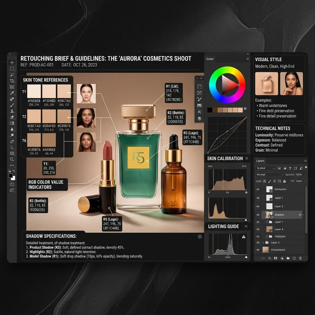
The quality gap between what you imagined and what you received almost always lives in the brief — not in the retoucher's skill. A retoucher working from an incomplete brief is guessing at your standards. They'll make reasonable assumptions, and those assumptions will be wrong in ways that cost you revision rounds, delayed delivery, and sometimes an entire re-edit. This guide covers every element of a brief that actually controls the output, including the things most clients forget to specify and the subjective words that should never appear in a brief at all. For broader context on working with an outsourced studio, see our guide to outsourcing product photo editing.
Why Bad Briefs Cause Bad Retouching — And Who Pays
The economics of a bad brief are worse than they appear at first invoice. When a brief is vague, retouchers apply their own interpretation of your standard. The re-edit request that follows typically takes as long as the original edit. If the re-edit also misses — because the feedback on the re-edit was as vague as the original brief — you're now three rounds in on work that should have been right on the first pass. Most studios cap free revisions at one or two rounds; anything beyond that is billable time. A brief that takes twenty minutes to write can eliminate two paid revision rounds and a week of back-and-forth. The cost of precision is always lower than the cost of ambiguity.
What to Include in Every Brief
1. Reference Images: Good and Bad Examples
The single most useful element of any retouching brief is a set of reference images — and critically, both good and bad examples. A retoucher who sees only your target standard has to infer what you want to avoid. Show them images that represent the result you're after, and images that represent the errors you're most concerned about:
- Good references: Images that match your brand's visual standard — ideally from your own catalog or from competitors whose output you admire.
- Bad references: Examples of the specific errors you've seen or want to avoid — over-smoothed skin, milky background instead of pure white, harsh drop shadows, clipped highlights on reflective surfaces.
The gap between your good and bad reference images is more precise than any written description of the same thing.
2. Target Marketplace
Specify the platform or platforms the final images will appear on. Amazon's main image rules (pure white, 85%+ product fill) are different from Shopify's catalog grid requirements, which are different again from Etsy or Instagram Shopping. A retoucher who knows the destination marketplace can apply platform-appropriate background tone, crop, and fill percentage without you having to specify each one individually.
3. Background Colour: RGB Values, Not Words
Never specify background colour using words. "White," "pure white," "bright white," and "off-white" are interpreted differently by every retoucher — and by every monitor they're working on. Specify background colour using RGB values:
- Amazon main image compliant: RGB 255, 255, 255 (pure white, not near-white)
- Lifestyle / editorial white: RGB 248, 248, 248 or similar — specify the exact value
- Grey catalogue background: RGB 243, 243, 243 — again, the exact value
If you're not sure what RGB value you want, open a previous approved image in Photoshop and sample the background with the colour picker. That number is your spec.
4. Product Fill Percentage
State the percentage of the frame the product should occupy. Amazon requires 85% minimum for main images. Most brands targeting a consistent catalog grid specify 85–90% for a cropped, product-forward look, or 75–80% for more breathing room. Without this number, crop decisions are made by the retoucher — and they will vary across your catalog.
5. Colour Accuracy Note
If your products are colour-critical — apparel, paint, cosmetics, food — include an explicit note that colour accuracy takes priority over style. Without this, retouchers may apply stylistic colour grading that makes images look consistent with each other but inaccurate to the physical product. Note the colour profile you need in the output file (sRGB for web and e-commerce; Adobe RGB if you're producing for print alongside digital).
File Format Requirements
Specify output format, resolution, and colour profile explicitly. A complete file spec looks like this:
- Output format: JPEG at 90% quality AND PNG with transparent background (both, for each image)
- Output resolution: 2000 × 2000 px, 72 DPI
- Colour profile: sRGB IEC61966-2.1 (standard for all web and marketplace output)
If you need multiple output sizes for different platforms, list each one — don't expect the retoucher to know which sizes your platforms require. Our e-commerce photo editing service delivers in pre-specified platform profiles as standard, which eliminates the format spec step on your end.
How to Communicate Skin Tone
Skin tone is one of the most common briefs written poorly and one of the most consequential when it goes wrong. "Natural," "realistic," and "clean" tell a retoucher almost nothing, because those words mean different things depending on the retoucher's own reference point and monitor calibration. Specify skin tone as a range with an anchor reference:
- Include a reference image of a result you consider correct — ideally an approved image from your own previous work
- Describe what you want preserved: skin texture, specific tonal range, the level of evening-out that's acceptable
- Describe what you want avoided: over-smoothing that removes pore detail, colour casts (warm orange, cool grey), artificial brightening of shadows
If your products include multiple models with different skin tones, provide a separate reference for each and note that the retouching standard should be applied consistently across all skin tones — not normalised toward a single reference point.
How to Communicate Shadows
Shadow treatment is among the most frequently under-specified elements of a brief. Specify each of the following:
- Drop shadow: Yes or no. If yes, direction (typically 315° for a light source from top-left), distance from product, size (spread), and opacity percentage (30–50% is natural; 70%+ is heavy).
- Natural shadow: Retain the shadow cast in the original shot, or remove it. If retaining, specify whether to clean it or leave it as-shot.
- Reflection shadow: Mirror reflection below the product — yes or no. If yes, specify opacity (usually 20–40%) and fade distance.
If you have a preference for how shadows look, include a reference image. Our shadow and reflection service handles each of these shadow types as a separate specification, which is the correct way to brief them.
What NOT to Include in a Brief
Certain words and phrases appear in almost every retouching brief and communicate almost nothing. Remove these from your brief entirely:
- "Make it pop" — this has no technical meaning. Specify what you want to increase: contrast, saturation, sharpness, background separation. Use a number or a reference.
- "Vibrant" — vibrant to whom, on which display, calibrated to which profile? Specify saturation as a direction ("increase saturation slightly, keeping within natural range") or provide a reference.
- "Clean" — clean background, clean skin, clean product? And how clean? Specify each element separately with a reference or a parameter.
- "Professional look" — this describes an outcome you want, not a specification the retoucher can hit. Replace it with the specific elements that constitute professional to your brand: consistent background, precise masking, controlled shadow, accurate colour.
Every subjective word in your brief is a decision you're handing to the retoucher to make on your behalf. Make those decisions yourself, in advance, with a reference or a number.
Feedback Loop: How to Mark Up Rejected Images
How you give feedback on rejected images is as important as how you wrote the original brief. "Redo this" tells a retoucher that something is wrong but not what or why. Markup-based feedback is faster and produces better re-edits:
- Use annotation tools (Adobe Acrobat, Markup.io, or even Google Slides) to draw directly on the rejected image
- Label each issue specifically: "edge artifact at left shoulder," "background too warm — should be RGB 255,255,255," "shadow opacity too high — reduce to 35%"
- Separate cosmetic issues (fixable in the re-edit) from structural issues (the entire approach to the image is wrong) — structural issues need a conversation, not just a marked-up image
Keep feedback tied to parameters from the original brief. If a re-edit misses because the parameter wasn't in the brief, the issue is the brief — update it before sending the next batch.
Brief Template: Copy and Use
The following structured brief covers the essential elements for a standard e-commerce product retouching batch. Copy it, fill in the values specific to your project, and send it with your files:
- Project name: [Brand name] — [Batch ID or date]
- Image count: [Number of files]
- Product type: [Product category — e.g., apparel, footwear, hard goods, cosmetics]
- Target marketplace: [Amazon / Shopify / Etsy / other — list all]
- Background colour: RGB [R, G, B] — [reason, e.g., "Amazon main image compliant"]
- Product fill: [XX]% of frame, centred
- Colour accuracy: [Priority level — "Colour accuracy takes priority over stylistic grading. Preserve natural colour; do not apply warming or cooling grade."]
- Skin tone (if applicable): [Reference image attached. Match tonal range. Preserve skin texture. Avoid over-smoothing and colour casts.]
- Shadow: [Drop shadow: yes/no. If yes: direction [°], distance [px], opacity [%]. Natural shadow: retain / remove. Reflection shadow: yes/no, opacity [%].]
- Output format: JPEG [quality %] + PNG transparent background
- Output size: [Width × Height px], [DPI], [colour profile]
- Reference images: [Folder name or file names of good and bad examples attached]
- Additional notes: [Any product-specific issues, e.g., "product has reflective metallic surface — avoid blowing out highlights"]
When to Outsource and What to Expect
A well-written brief is the foundation, but outsourcing to the right studio matters equally. The first batch with any new retouching partner should be treated as a calibration batch: send 5–10 images with a complete brief, review the results carefully before approving the full batch, and use any corrections as brief updates rather than re-edit requests. Once the brief is calibrated, subsequent batches should require minimal revision.
If revision rates remain high after two or three calibration batches, the issue is usually one of two things: the brief is still under-specifying something, or the studio's production standard isn't a match for your requirements. Both are diagnosable from the patterns in rejected images.
For brands ready to move to a fully briefed outsourced workflow, our e-commerce photo editing service accepts structured briefs in exactly the format above, with a free trial batch available at free-trial to calibrate your spec before committing to volume.