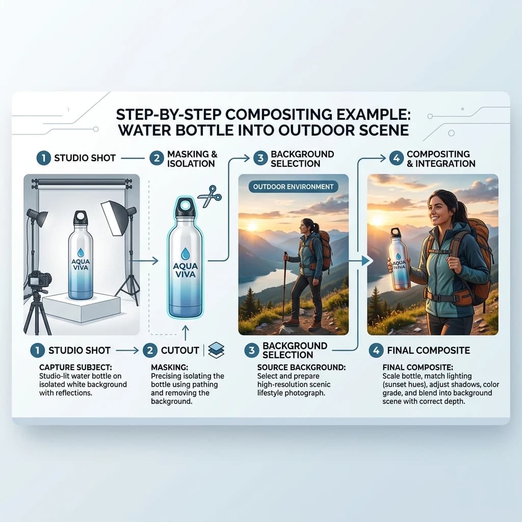
Lifestyle product composites are everywhere in e-commerce — a bottle of serum sitting on a marble bathroom counter, a backpack on a mountain trail, a candle next to a sunlit window. None of those scenes were shot together. The product was photographed in a studio, the background came from somewhere else entirely, and the two were merged in post-production. Done well, nobody notices. Done badly, it looks like a sticker pasted onto a stock photo. Here's the actual workflow, step by step, including the mistakes that give composites away.
What Is a Product Composite
A product composite combines a studio product shot — usually photographed on a plain white or seamless background under controlled lighting — with a separate lifestyle background, blended together in post-production so the final image reads as one cohesive photograph. The product retains studio-grade sharpness and colour accuracy; the background supplies context, mood, and scale.
Why Brands Use Composites Instead of Full Lifestyle Shoots
- Cost. A full lifestyle shoot means booking a location or set, lighting it, and shooting every SKU on-site. A composite needs one clean studio capture per product and a reusable library of backgrounds — the cost difference compounds fast across a catalog.
- Lighting control. Studio capture means consistent, repeatable lighting across every product in a line, regardless of what scene it ends up in. No fighting cloud cover or a venue's fixed lighting rig.
- Infinite scenes from one shoot. The same studio capture can be composited into a dozen different settings — seasonal campaigns, regional contexts, A/B tested backgrounds — without re-shooting the product.
Step 1: Shoot the Product on a Consistent Light Setup
Everything downstream depends on this step. Use a repeatable three-point setup — key light, fill light, and a lit or seamless background — and keep the lighting direction and ratio consistent across every product you intend to composite into the same scene type. If you shoot one product lit hard from the left and another lit flat from the front, you'll be fighting mismatched lighting in every composite later. Shoot on pure white or a solid colour that separates cleanly from the product's edges, especially around fine details like hair-thin straps, fabric fringe, or glassware.
Step 2: Background Removal to Isolate the Product
Once the studio shot is captured, the product needs to be cleanly separated from its background — every pixel of the original backdrop removed, edges preserved, and semi-transparent areas like glass, mesh, or sheer fabric still handled with partial transparency rather than a hard cut. This is the single step most likely to produce a visibly fake composite if rushed: a hard, aliased edge around the product is the first thing a viewer's eye catches. Our background removal service handles this isolation at production scale, including the trickier edge cases — fur, glass, jewelry chains — that automated one-click tools tend to butcher.
Step 3: Choosing a Background Scene
With the product isolated, you need a background that fits the brand and the product's use context. There are three practical sources:
- Licensed stock photography. Fast and affordable, but check the license terms for commercial and advertising use specifically — many stock licenses restrict use in paid ads or large-scale print, and using an unlicensed or under-licensed image is a real legal exposure, not just a quality issue.
- Custom 3D renders. A rendered scene gives full control over camera angle, lighting direction, and perspective, and can be built to match the product shot's lighting exactly from the start — the best option when you need a scene no stock library has.
- AI-generated backgrounds. Increasingly viable for fast iteration and testing multiple scene concepts cheaply, though current AI generation can introduce subtle inconsistencies in perspective or surface logic that need a trained eye to catch before publishing.
Step 4: Matching Lighting Direction — the Most Common Mistake
This is where most amateur composites fail, and it's almost always the same error: the product is lit from one direction and the background scene is lit from another. A product with highlights on its left edge, dropped into a scene where every other surface is clearly lit from the right, reads as wrong even to viewers who can't articulate why. Before compositing, study the background's light source — direction, height, hardness, and colour temperature — and either select a product shot that already matches, or adjust the product's lighting in post to align. Shadows, highlight placement, and reflections all need to agree with the scene's light source, not just the product's original studio setup.
Step 5: Shadow Creation
A product with no shadow looks like it's floating, which is the second most common giveaway after mismatched lighting. Two approaches:
- Cast shadow — a directional shadow projected onto the surface beneath and behind the product, matching the angle and softness of the background scene's light source. This is the right choice for most lifestyle composites, since real surfaces in real scenes produce real directional shadows.
- Drop shadow — a soft, generic shadow placed directly beneath the product without strict directionality. It reads as more "designed" than "photographed," which makes it the wrong choice for lifestyle composites aiming for photorealism, though it has its place in flatter e-commerce contexts.
We cover the technical differences between shadow types — and when each is appropriate for different product categories — in detail in drop shadow vs reflection shadow vs natural shadow for product photos. For lifestyle composites specifically, cast shadow matched to the scene's light source is almost always the right call.
Step 6: Colour Grading to Unify Product and Background
Even with matched lighting direction and a correct shadow, a composite can still look wrong if the colour temperature of the product doesn't match the scene. A studio shot lit with neutral 5500K lighting dropped into a warm, golden-hour background scene will read as cold and out of place. The final step is a unifying colour grade — adjusting the product's white balance, contrast, and overall colour cast to sit within the same colour world as the background, often with a subtle overall grade applied across the whole composite to tie everything together as one image.
Common Failure Modes
- Unrealistic scale. A product sized larger or smaller than it would actually appear in the chosen scene breaks the illusion immediately — always check the product against real reference objects in the background for scale.
- Mismatched colour temperature. Covered above — the most common reason a technically clean composite still feels "off" to viewers.
- No shadow, or a shadow that doesn't match the light source. Either floats the product or visibly contradicts the scene's lighting logic.
- Edge artifacts from rushed background removal. Fringing, haloing, or a visible cutout line around the product, especially on fine detail or semi-transparent materials.
- Reflections that don't include the product. If the background scene has a reflective surface — a mirror, a glossy counter, a window — and the product doesn't appear in that reflection, the composite breaks under any close inspection.
When Composites Work vs When They Don't
Composites work best for solid, opaque products with clearly defined edges — cosmetics, packaged goods, apparel accessories, electronics. They get significantly harder for transparent products like glassware or perfume bottles, where the background needs to show through the product correctly and refract realistically, and for highly reflective surfaces like polished metal or glossy ceramics, which pick up reflections from their actual studio environment that won't match the new background scene. These categories aren't impossible to composite, but they demand far more skill and often a custom studio setup designed around the target background from the start, rather than a generic white-background shot composited after the fact. Before committing a transparent or highly reflective product to compositing, run a test with a few shots: check whether the refraction reads realistically, whether the product reflections make sense within the background scene, and whether the colour temperature of the studio lighting matches the scene lighting closely enough to require only minor correction.
When to Outsource
A single hero composite is achievable in-house with patience and the right software. The challenge is consistency at catalog scale: matching lighting direction and shadow logic across dozens or hundreds of SKUs, maintaining a coherent colour grade across an entire campaign, and producing clean edge isolation on every product without slowing down a launch calendar. Our e-commerce photo editing service handles the full composite workflow — background removal, scene compositing, lighting and shadow matching, and colour grading — at production volume, so lifestyle imagery stays consistent across an entire catalog without each composite becoming a one-off custom job. If you have products ready to composite, submit 5 images for a free sample batch and see what production-quality compositing looks like for your specific product type before committing to a full campaign.